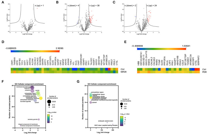
Figure 3.
Overview of significantly regulated proteins in diabetic subgroups compared to control group. (A–C) Volcano plots of proteomic data. Volcano plots were generated in the software Perseus, comparing the differential protein expression in tear fluid between nondiabetic healthy controls and (A) T2D group, (B) T2D with NPDDR, and (C) T2D with PDR. The points indicate different proteins that display magnitude fold-changes (Log2; x-axis) and the p-values (–Log10; y axis) of all proteins quantified in control group and each one of the other groups (two-sample t-test; FDR = 0.05, S0 = 1). Proteins with significant increases are indicated by red circles. Proteins with significant decreases are depicted by blue circles. (D,E) Heatmaps of the differentially expressed proteins. Protein expression values were log2 normalized. Data corresponding to the proteins differentially expressed when comparing (D) NPDR and (E) PDR with the controls. Red indicates a high expression level; blue indicates a low expression level. (F,G) Bubble plots showing the enrichment for GO cellular component terms for the significantly expressed proteins in NPDR and PDR groups. The log2 (fold change) in x-axis represents the ratio of total proteins identified and the different proteins expected to be related to each cellular component; the size of the bubble represents the number of proteins for each cellular component and color represents the –log10 (p-value), which indicates the statistical significancy. No statistically significant enrichment was found in biological process (not presented).

