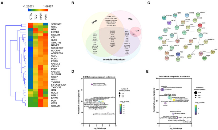
Figure 4.
Multiple comparison analysis between the diabetic subgroups and the control group. (A) Heatmap of the 32 significantly expressed proteins across replicates among diabetic subgroups and control group, showing a clear distinction between all the groups, and NPDR and PDR subgroups compared to control group. (B) Venn diagram displaying the overlapping statistically significant proteins between each diabetic subgroup vs. control group and, the comparison of the different groups with each other (multiple comparison). (C) STRING network interactome analysis of statistically significant proteins in multiple comparison. PPI enrichment p-value: 0.00357. Each node represents the 32 statistically significant proteins, the 11 edges represent the protein-protein associations (functionally or physically) and each edge strength represents the confidence of interaction. (D) Bubble plot displaying the significantly enriched GO Molecular function terms for significantly expressed proteins. The log2 fold change in x-axis represents the ratio of proteins; the size of the bubble represents the number of proteins and color represents the statistical significancy. (E) Bubble plot displaying the significantly enriched GO Cellular component terms for the differentially expressed proteins in multiple comparison analysis. Extracellular vesicle and extracellular organelle represented by overlapping yellow bubbles, are the most significant cellular component. No statistically significant enrichment was obtained in biological process (data not shown).

