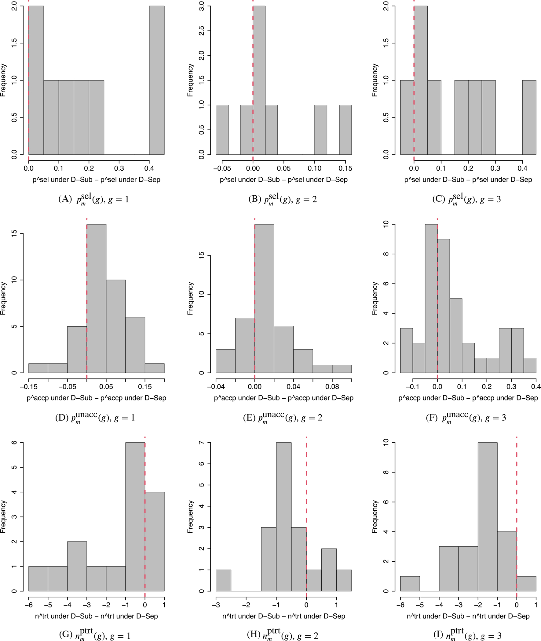
FIGURE 3.

Comparison between D-Sub and D-Sep. A-C, Histograms of differences in between the D-Sub and D-Sep designs. D-F, Histograms of differences in between D-Sub and D-Sep for the truly unacceptable doses and those between D-Sep and D-Sub for the truly acceptable doses. G-I, Histograms of differences in between D-Sub and D-Sep for the truly unacceptable doses. The left, middle, and right columns are for subgroups g = 1 (favorable), g = 2 (intermediate), and g = 3 (poor). A positive value indicates better performance of D-Sub than D-Sep in Panels A-F, and a worse performance in Panels G-I
