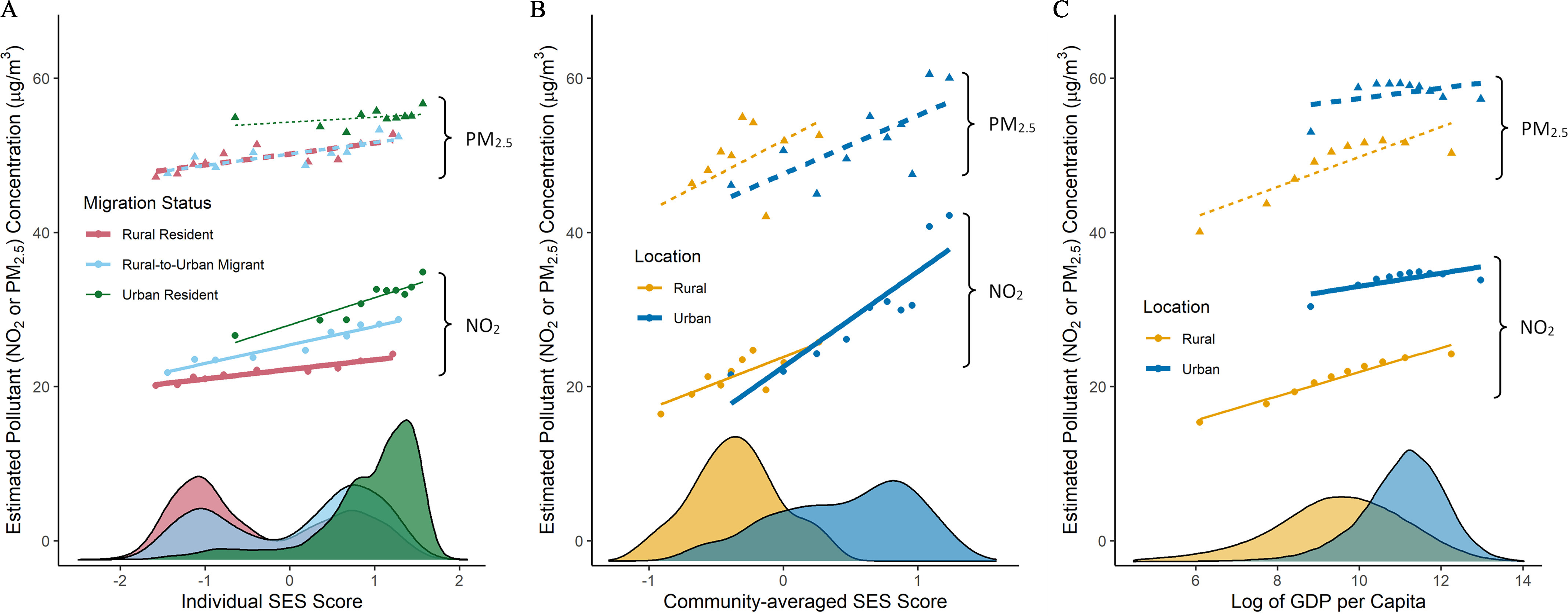
Figure 2.

Relationship between SES and ambient and concentrations, based on (A) individual data, (B) areal data derived by aggregating the individual data to the community-level, and (C) areal data derived from national gridded GDP and world population density data sets. Data are plotted by urban–rural status, reflecting available data for individual data (A), three groups (rural resident, urban resident, and rural-to-urban migrant); for areal data (B,C), two groups (rural, urban). SES values reflect available data: (A) individual SES, (B) community-averaged SES, and (C) GDP per capita. Each plotted point represents the mean pollution concentration for 10% of the subsample. For example, in (A), the left-most red point represents the 10% of the rural residents with the lowest standardized SES score, and the right-most blue point represents the 10% of the rural-to-urban migrants with the highest standardized SES score. Plots also display best-fit lines and kernel densities. All of the best-fit lines have a positive slope { in all cases, except one [ for urban residents in (A); ]; for in (B) and all conditions in (C), }, indicating that in all cases considered, higher SES is correlated with higher concentrations of ambient air pollution. Note: GDP, gross national product; , nitrogen dioxide; , fine particulate matter; SES, socioeconomic status.
