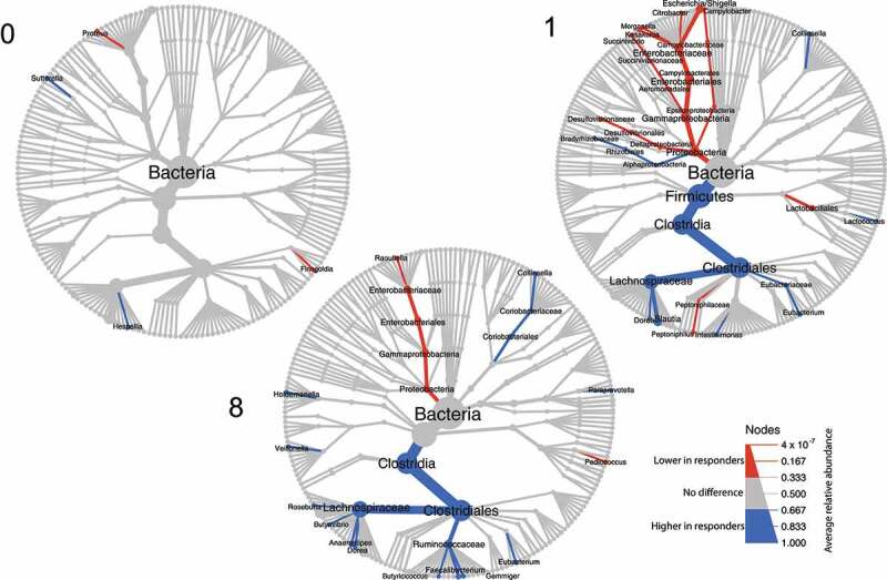
Figure 2.

Tree plot showing taxa with different relative abundances between outcomes. The largest node in the center is the kingdom bacteria. Along the tree branch outward, the next node is the phylum level, then followed by class, order, family, and genus. The size of the node is proportional to the mean relative abundance in the corresponding phylogenetic level. A node is labeled when it has significantly different relative abundances (Wilcoxon rank-sum test) between outcomes. Blue refers to higher abundances in responders, red refers to lower abundances in responders. The three tree plots represent data from Week 0, 1, and 8.
