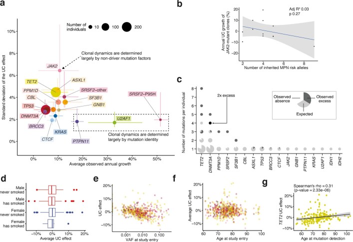
Extended Data Fig. 4. Differences in growth rate between individuals/clones with the same driver.
a, For each gene, we contrast the mean annual growth rate among individuals/clones bearing a mutation in that gene, with the spread in this rate (defined here as the standard deviation of the unknown-cause (UC) growth). Circles represent point estimates, with circle size indicating the number of clones bearing a mutation in that gene, and lines representing the 90% confidence interval (CI). For the standard deviation, the 90% CI was calculated assuming that , with being the sample size, the standard deviation estimate and the true population variance. SRSF2-P95H mutations are plotted separately to other SRSF2 mutations, as they are associated with significantly different growth dynamics (n = 633 clones). b, Relationship between number of inherited MPN risk alleles and JAK2-mutant clonal growth rate (Pearson R2 = 0.03; p = 0.27 (two-sided)). The grey band represents the 95% confidence interval for the linear regression. c, The number of mutations per individual in each gene is plotted. Each data-point is a pie-chart, the size of which reflects the number of individuals. For each gene, given the observed mutation prevalence in our cohort, the pie is fully light grey if the number of individuals we observed with the specific number of mutations is the same as the number of individuals we expected by chance. The presence of a white segment indicates that we found fewer individuals with that number of mutations than expected. The presence of a dark grey segment indicates that we found an excess of individuals with that number of mutations. We estimate the expected number of mutations in each gene in each individual through Monte Carlo estimation; assuming the prevalence of mutations in the cohort is uniform for each gene across individuals, we simulate 1,000 scenarios where we randomly distribute these mutations given the number of mutations in each individual. d, Association between sex and smoking history and the average UC effect for each individual (n.s.; n = 628 clones). The boxes represent the 25th, 50th (median) and 75th percentiles of the data; the whiskers represent the lowest (or highest) datum within 1 interquartile range from the 25th (or 75th) percentile. e, Association between VAF at study entry and the average UC effect for each individual (R2 = 0.062; CI95% = [0.029,0.107]; p = 2.42*10−9). f, Association between age at study entry and the average UC effect for each individual (n.s.). g, Association between age at mutation detection and UC effect for each TET2-mutant clone (Spearman’s rho = 0.31; p = 2.33*10−6 (two-sided)). The grey band represents the 95% confidence interval for the linear regression.

