Figure 3.
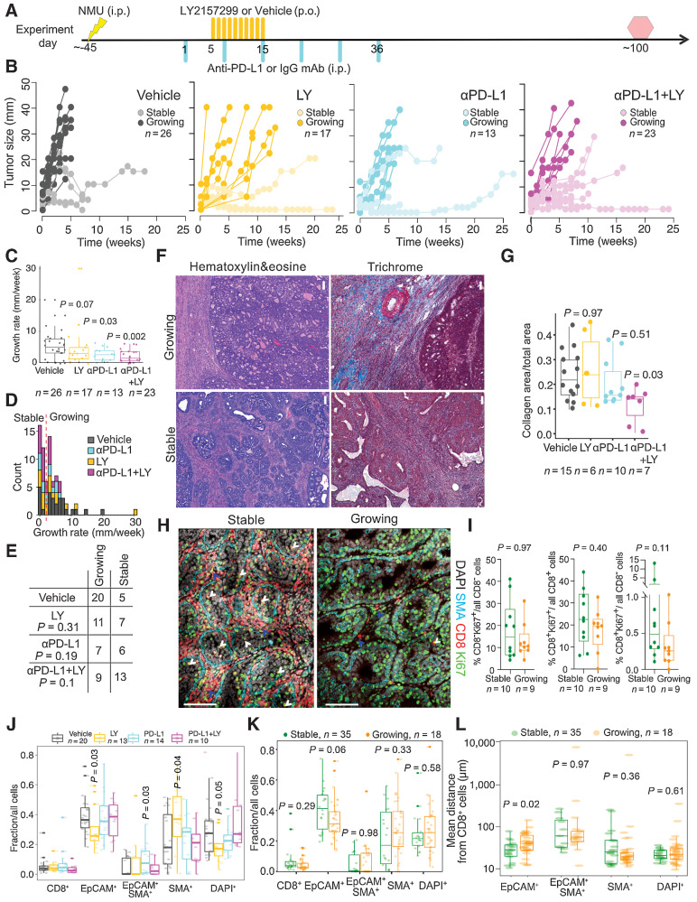
The effect of immunotherapy on tumor progression. A, Schematic experimental outline. Yellow and turquoise lines indicate treatment with LY2157299 (LY) and anti–PD-L1, respectively. Yellow lightning marks NMU injection. Red hexagon, experimental endpoint. B, Graphs depicting changes in diameter of tumors from the immunotherapy cohort. C, Individual tumor growth rates. Quartiles and range are shown. P value calculated on the basis of comparison of treated versus vehicle groups using a Mann–Whitney–Wilcoxon test. D, Histogram depicting growth rate distribution and the local minimum (red dashed line) between the two peaks used for growing/stable classification. E, Summary of tumor growth categories in each treatment group. P values were calculated using χ2 test. F, Representative images of H&E and trichrome staining. Scale bar, 100 μm. G, Graph depicting quantification of collagen content in stable and growing tumors and in the indicated treatment groups. Shown are quartiles and range. P values calculated by Mann–Whitney Wilcoxon test. H, Immunofluorescence analysis of SMA, CD8, and Ki67 in 10 stable and nine growing tumors. Scale bar, 100 μm. White arrows, Ki67+CD8+ cells in direct contact with malignant cells. Blue arrows, stroma-restricted Ki67+CD8+ cells. I, Graph illustrating quantification of immunofluorescence analysis of SMA, CD8, and Ki67 in stable and growing tumors. Shown are quartiles and range. P values calculated by Mann–Whitney–Wilcoxon test. Tumor cellular composition analysis by automated cell classification from WSI scans of immunofluorescence images stratified by treatment arm (J) or growth rate (K). Quartiles and range are shown. P values were calculated using the Mann–Whitney Wilcoxon test against vehicle. L, Nearest neighbor distance analysis for CD8+ cells to all other cell types from WSI. Quartiles and range are shown. P values were calculated using the Mann–Whitney–Wilcoxon test. All tests for significance used Mann–Whitney–Wilcoxon test using a threshold of P = 0.05 unless otherwise specified; error bars representative of SD; box-whisker plots indicate 0th, 25th, 50th, 75th, and 100th percentiles.

