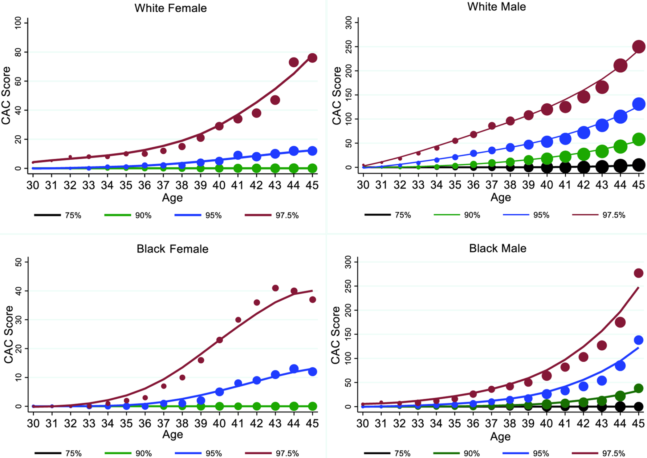
Figure 2. Estimated weighted CAC percentiles by age for each sex/race group.

White females (top left), White males (top right), Black females (bottom left), and Black males (bottom right). Each plot shows the estimated curves for the 75th (black line), 90th (green line), 95th (blue line), and 97.5th (red line) percentiles of CAC across age. Individual points reflect the observed empirical percentiles for each age with larger point size indicating more subjects at that age within each graph.
