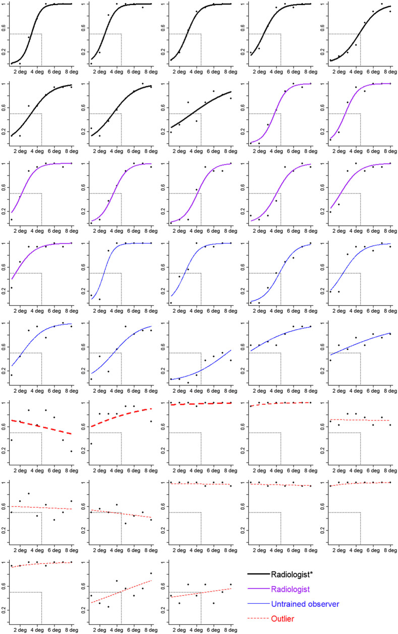
Fig. 7.
Estimated spread in the line task as a function of spread of the lines for each participant. The axis is the proportion of trials for which the participant said the dots were more spread. The axis is the spread of the lines (in units of degrees between closest lines). Symbols correspond to mean estimates. Curves are logistic regressions based on the random effect coefficients from a GLMM. Participants are grouped by expertise. Thick black lines correspond to radiologists who spend at least some of their clinical time in breast imaging (radiologist*). Medium purple lines correspond to radiologists who spend no clinical time in breast imaging (radiologist). Thin blue lines correspond to untrained observers (untrained obs), and red dashed lines correspond to participants identified as outliers (with thickness corresponding to expertise). The value of the spread of the lines at the point where the curve intersects the horizontal gray dashed line corresponds to the participant’s PSE. The vertical gray dashed line corresponds to the POE, which is the spread of the lines that is equally less and more spread. Curves that intersect the horizontal line to the left of the vertical line indicate a bias to overestimate spread (top-left panel is one example). Curves that intersect the horizontal line at the vertical line indicate no bias (first row, last panel is one example).

