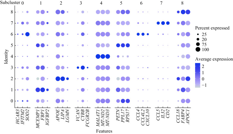
Figure 4.
Dot plot showing the expression of the top 3 marker genes in each macrophage subcluster across all 9 macrophage subclusters.
The X-axis represents gene markers and the Y-axis represents the subclusters in Fig. 3A. The dot size refers to the percentage of cells expressing the gene of each subcluster. The color intensity is related to the average log-normalized gene expression of each subcluster.

