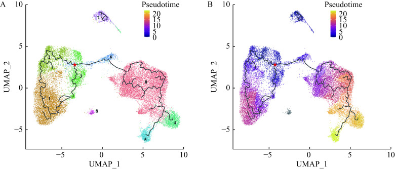
Figure 8.
UMAP plot of different macrophage subclusters colored by pseudo-temporal trajectory analysis.
The red star represented the start of the root of the pseudo-temporal trajectory branch. Black lines refer to trajectories of principal graph. A: UMAP plot of the pseudo-temporal trajectory branch from 9 identified macrophages subclusters. Different colors specify assignment of the 9 subclusters by nearest neighbor clustering in Fig. 3A. The numbers represent different macrophage subclusters. B: UMAP plot showing the pseudo-temporal trajectory analysis of different macrophage subclusters. The color intensity represents the pseudo time in the UMAP plot. UMAP: Uniform Manifold Approximation and Projection.

