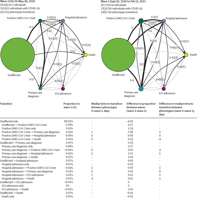
Figure 3.
COVID-19 trajectory networks
The size of the circles represent the number of individuals with that event relative to the total study population. Numbers on arrows show the proportion of individuals who transitioned to each phenotype (relative to the number of individuals in that COVID-19 wave). Numbers in square brackets show median number of days between events across all individuals with that transition. Median days between individuals who were unaffected (ie, no recorded COVID-19 phenotype) and other severity phenotypes are not shown since they were not directly comparable between waves, due to difference in length of the two periods. Thick arrows represent transitions that occurred in 0·1% of individuals or more. Thin black arrows represent transitions that occurred in 0·01% individuals or more. Any transitions that occurred in fewer than 0·01% of individuals are not shown. All included individuals were alive and had no previous COVID-19 events recorded before the start date of the specified waves.

