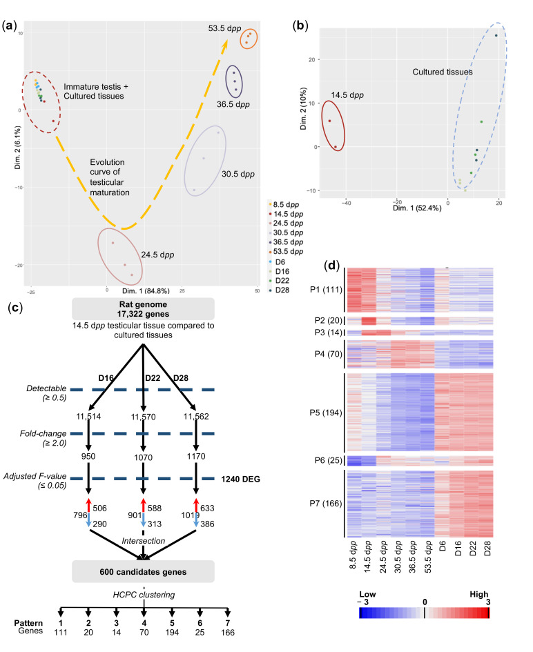
Figure 3.
Transcriptomic analyses of in vitro and in vivo testicular tissues. (a) Scatter plot representing the position of each sample along the first two dimensions. Each point represents the average expression level of transcripts, one dot per replicate. The variability between samples is mainly explained by their age of development (Dimension 1, 84.8%). The different clusters, represented by colored circles, highlight the distance between each group of transcriptomes. An evolution curve of the transcriptome of maturing testicular tissues is represented in yellow. (b) PCA analysis conducted on the red dotted circle is shown in panel A, corresponding to cultured tissues and 14.5 dpp immature testes. The variability between groups is mainly explained by the origin of the tissue (in vivo vs. in vitro). All the in vitro-matured tissues display similar transcriptomic profiles. (c) Flowchart summarizing the filtration and clustering strategies. The numbers below the cluster ID indicate the genes falling into each cluster. (d) A false-color heatmap summarizes the seven patterns defining the global concentrations for transcripts across the entire sample set. Each line corresponds to a gene and each row to the mean expression value of a replicate. P1 to P7 refer to the number of patterns, followed by the number of genes included in each pattern in parenthesis. A color scale is shown for standardized values in RPKM, per million mapped reads. n = 3. Dpp—days post-partum; HCPC—hierarchical clustering on principal components; RPKM—reads per kilobase of transcript.

