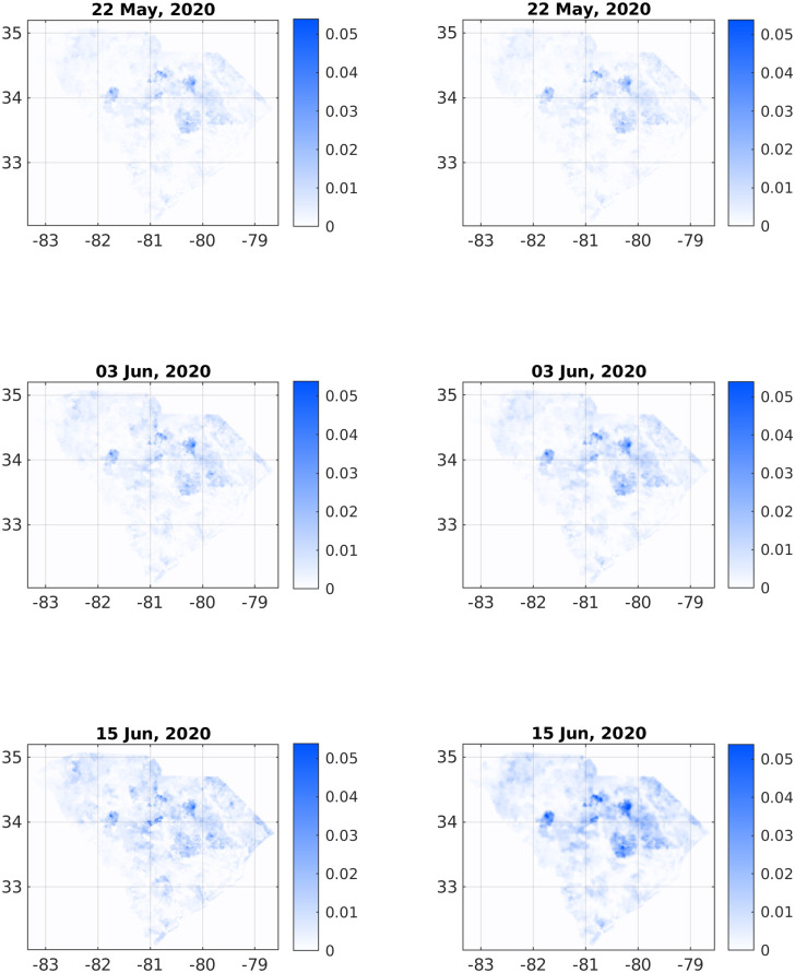
Fig 3. Comparison of infection dynamics between the data from the DHEC (left column) and the theoretical model (right column).
In both columns, images correspond to the sum f(x) + w(x) + r(x). The heading for each panel shows the date, starting from May 22, 2020, corresponding to relative times t = 0, t = 12, and t = 24 days. See later times in Fig 4.

