Fig. 3.

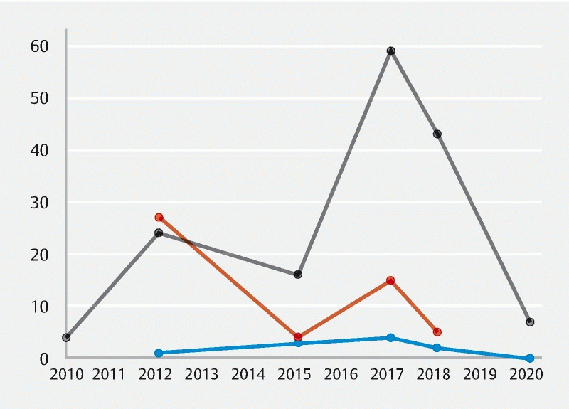
Scatter plot diagram depicting the graded evidence quality by the year the measure was published. Blue represents high-quality evidence, orange represents moderate-quality evidence, and gray represents low-quality evidence.

Scatter plot diagram depicting the graded evidence quality by the year the measure was published. Blue represents high-quality evidence, orange represents moderate-quality evidence, and gray represents low-quality evidence.