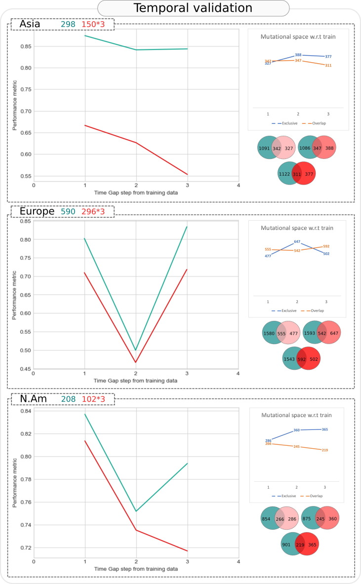
Figure 8.
Temporal validation of Asymptomatic-Fatal predictive model. The trend of ROC AUC and accuracy at various time gap windows (as shown on X axis), wherein window 1 contained test samples which were chronologically closest to the most recent SARS-CoV-2 genome in training data, while window 3 contained most distant samples (number of samples employed in training and each test window is depicted in the header of each geography specific panel). Y axis represents the value of two performance metrices namely, ROC AUC (turquoise line) and accuracy (red line) of the model. The total number of unique (exclusive) mutations and common (overlapping) mutations in each test window, with respect to training data are plotted in grouped line charts above the Venn diagrams. Number of exclusive and overlapping mutations between training data and each tested window are also presented through the Venn diagrams.

