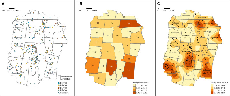
Figure 2.
Spatial distribution of (A) enrolled dengue cases by serotype across Yogyakarta City, (B) the cluster-aggregate test-positive fraction, i.e., the proportion of enrolled dengue cases among the total number of individuals enrolled in each cluster, and (C) kernel smoothing estimates of the spatially-varying test-positive fraction. Each map includes participants enrolled from January 2018 through March 2020. The borders in each map represent the cluster boundaries for the AWED trial. Clusters are labelled with their numerical code in panel B and their intervention status in panel C. Points represent the geolocated households of virologically confirmed dengue cases. Areas with darker shading in panels B and C have a higher proportion of dengue cases among enrolled AWED participants than areas with lighter shading. Smoothing bandwidth was selected by cross-validation.

