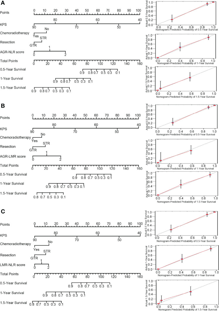
Figure 3.

Nomograms and calibration curve. In the nomograms (left panel), each variable was assigned different points that are indicated at the top scale, and the total points of all variables generated a numerical prediction of the 0.5-, 1.0- and 1.5-year survival rates, where a higher score indicates a worse outcome. In the calibration curve (right panel), the dotted line indicates the ideal prediction and the full red line indicates the performance of the nomogram. (A) Nomogram and calibration curve concerning AGN-NLR score; (B) Nomogram and calibration curve concerning AGR-LMR score; (C) Nomogram and calibration curve concerning LMR-NLR score.
