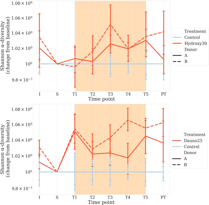
Figure 3.
Change from baseline of the Shannon Diversity Index in donors A and B, in all conditions. S is considered the baseline. Solid lines represent donor (A), and dotted lines represent donor (B) Light blue represents the controls, and red represents the treated groups. Orange square represents the treatment period (average and 68% CI). All time points are normalized so that control chambers average at 1. The top figure represents hydroxycarbamide, and the bottom figure represents daunorubicin.

