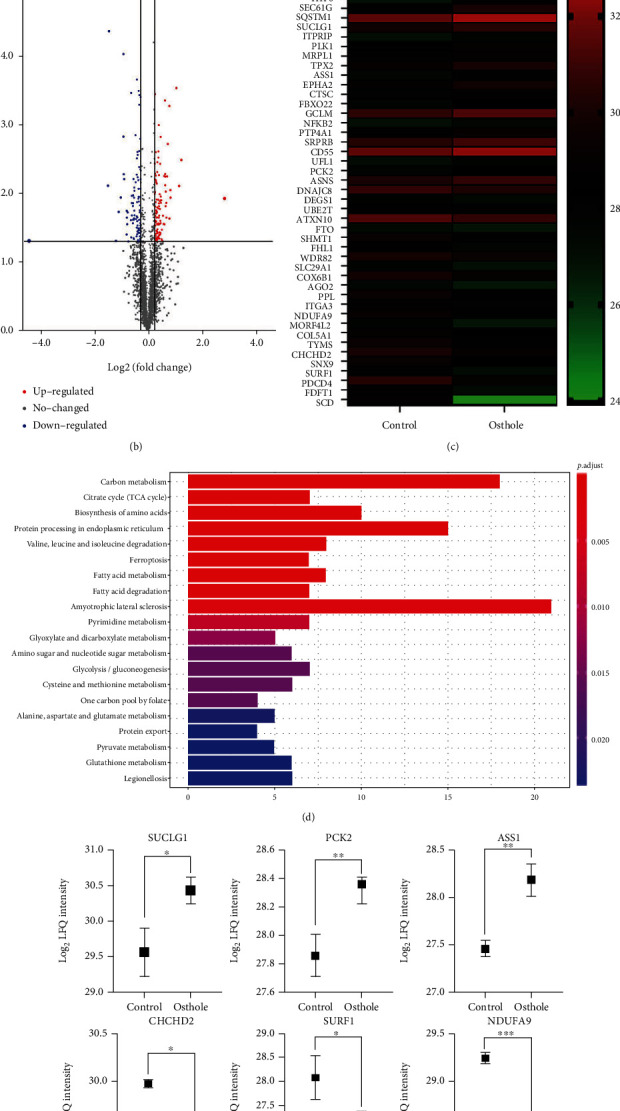
Figure 4.

Label-free quantitative proteomic analysis. (a) Venn diagram shows the coincident proteins and special protein between treated and untreated groups. (b) Volcano plot shows the difference in expression between treated and untreated cells. Red dots represent the upregulated proteins, and blue dots represent downregulated protein while grey dots represent unchanged proteins (log2 LFQ > 1.2, P < 0.05). (c) Heat map of differentially expressed proteins (log2 LFQ > 1.2, P < 0.05). (d) KEGG pathway analysis of differentially expressed proteins. (e) Mitochondria-related differentially expressed proteins. All data are represented as means ± SD; n = 3; ∗P < 0.05, ∗∗P < 0.01, and ∗∗∗P < 0.001 compared with the control group.
