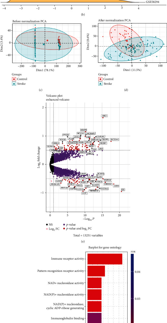
Figure 1.

(a) The ridge plot of the merged dataset before eliminating the batch effect. (b) The ridge plot of the merged dataset after eliminating the batch effect. (c) The Principal Component Analysis (PCA) plot of the merged dataset before normalization. (d) The PCA plot of the stroke group and control group of the merged dataset after normalization. Note: In PCA analysis, all genes were used to observe the effect of normalization. (e) Volcano map of DEGs; red represents significant differential genes, grey represents no significant difference genes, pink represents genes with differential log2FC, and purple represents genes with differential P value. (f) GO enrichment analysis, where the horizontal axis represents the number of DEGs under the GO term.
