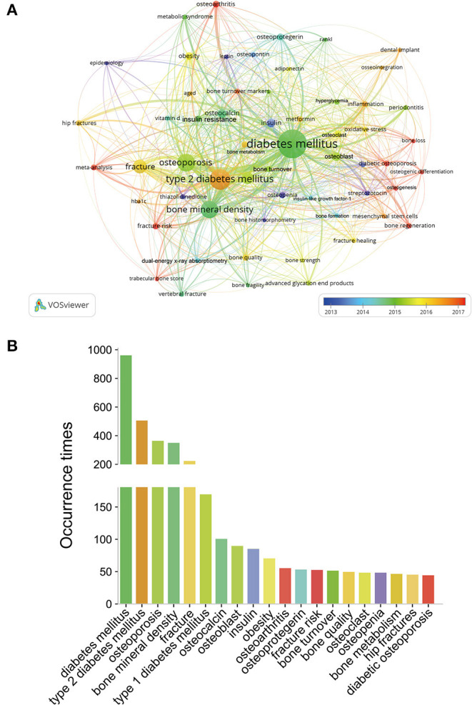
Figure 9.

(A) Overlay visualization map of keywords analysis in BMDM field based on the VOSviewer. The node size is proportional to the sum of occurrence times. The color of each node implies the average appearing year according to the color gradient in the lower right corner. The blue color represents the keywords appeared relatively earlier, and the dark red color reflects the recent occurrence. (B) Frequency distribution of the top 20 most frequent occurrences keywords.
