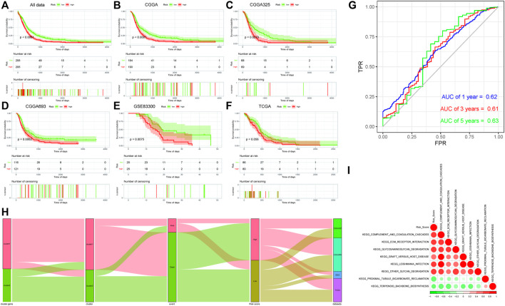
FIGURE 4.
(A–F): Kaplan–Meier survival analysis results of risk score subgroups in different data cohorts. The abscissa axis represents survival time, and the ordinate axis represents survival probability. (A) Kaplan–Meier survival analysis results of risk score subgroups in the comprehensive data cohort. (B) Kaplan–Meier survival analysis results of risk score subgroups in the CGGA data cohort. (C) Kaplan–Meier survival analysis results of risk score subgroups in the CGGA325 data cohort. (D) Kaplan–Meier survival analysis results of risk score subgroups in the CGGA693 data cohort. (E) Kaplan–Meier survival analysis results of risk score subgroups in the GSE83300 data cohort. (F) Kaplan–Meier survival analysis results of risk score subgroups in the TCGA data cohort. (G) Time-based ROC curve: the abscissa axis represents FPR (false-positive rate), and the ordinate axis represents TPR (true-positive rate). (H) Sankey diagram based on the distribution of characteristics. (I) Correlation analyses between the risk score and differential enrichment pathway score.

