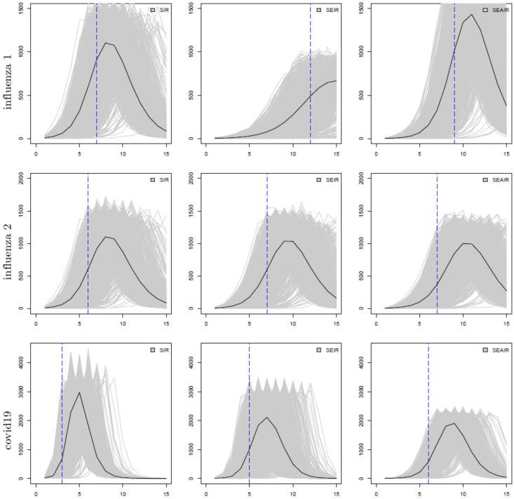
Fig 1. The number of infectious individuals (y-axis) at time t in weeks (x-axis); from left to right: SIR, SEIR, and SEAIR; from top to bottom the examples are influenza 1, influenza 2, then covid19.
Individual simulated outbreaks from 1000 simulations are shown as grey lines, and their average is denoted as a black line. The blue vertical dashed lines show the inflection points for each model.

