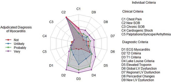
Extended Data Fig. 9.
The radar plot illustrates the characteristics of patients in terms of the presence of each individual criterion, separately for those with each adjudicated likelihood of myocarditis. A point in the center of the plot (for example, criteria D2, D3, and D4, for those patients adjudicated as not having myocarditis) indicates that the criterion was absent for all patients in this group. A point on the outer rim of the plot indicates that the criterion was present for all patients in that subgroup. The only exception to this is for Lake Louise criteria (criterion D4), which was coded as 0, 1, or 2, depending on the number of criteria present, so a point on the outer rim indicates all patients in the subgroup had both Lake Louise criteria. The colored regions identify the associations between each likelihood classification and potential diagnostic criteria. The diagnostic test criteria discriminate well between ‘Very likely’ and ‘Probable’, whereas this is not the case for Clinical Criteria, which are very much less specific.

