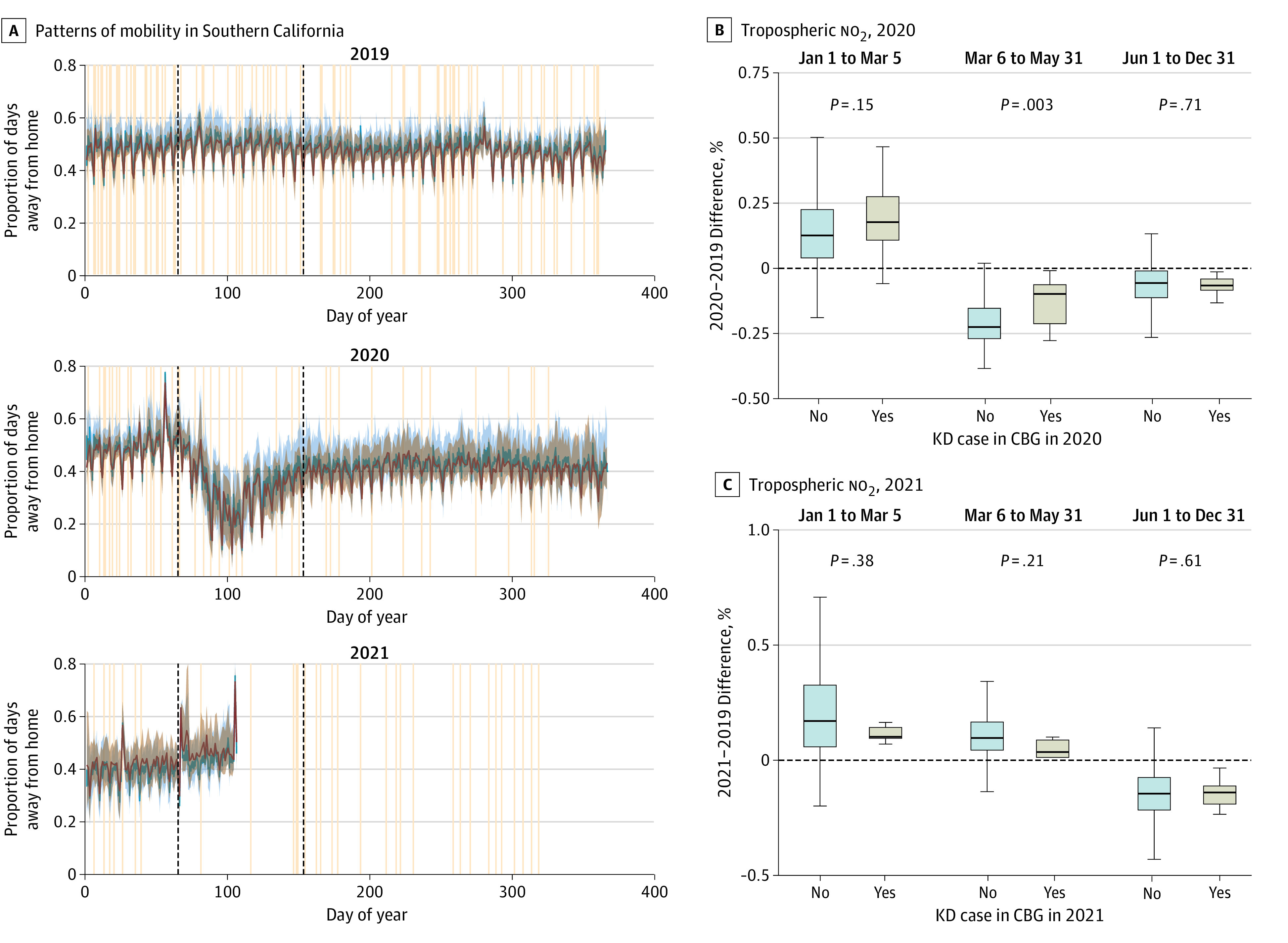
Figure 3. Mobility and Pollution Data.

A, Patterns of mobility for Southern California were defined as the fraction of the day spent away from home and Kawasaki disease (KD) incidence, 2019 to 2021. Red and blue curves and shading show the median and IQR for the fraction of the day spent away from home for each day in census block groups that had (red) or did not have (blue) KD cases during that year. Tan lines show dates of onset of fever for each KD case at Rady Children’s Hospital San Diego. Black dashed lines show the 2020 pandemic-related shutdown and are included in 2019 and 2021 for comparison. B and C, Changes in tropospheric no2 levels relative to the same period in 2019 for CBGs that had or did not have KD cases during that year and pandemic time period. Boxes indicate the IQR; bar, median; and whiskers, 1.5 × IQR. In 2020, during the shutdown period (March 3 to May 31), CBGs with KD cases had significantly smaller reductions in pollution (ie, neighborhoods where the no2 levels were more similar to prepandemic levels were more likely to have KD cases during that period).
