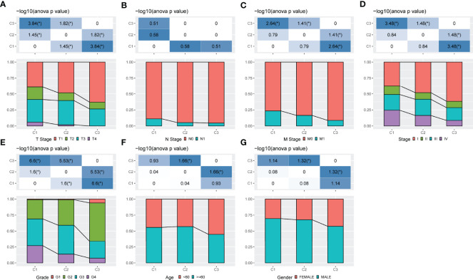
Figure 4.
Comparison of different molecular subgroups with clinical information. (A–G) The distribution of samples in different groups in the TCGA-KIRC cohort. The horizontal axis represents the different groupings of samples while the vertical axis represents the percentage of clinical information in the corresponding grouped sample. Different colours represent different clinical information. The table above represents a certain clinical feature distribution in any two groups and analyses the p value using the chi-square test.

