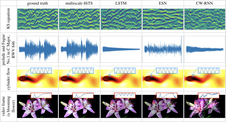
Figure 7.
Outputs of different network architectures (column) on each training sequence (row). We use different visualization schemes to show the results: for the KS equation and the music excerpt, we plot the time series evolution, that is, the horizontal axes represent time; for the cylinder flow and the video frame, since each state is a two-dimensional array, we choose to visualize the last frame of our reconstruction, however, we also visualize the time evolution of some states averaged over a small patch of pixel values. For a video that shows the performance, visit: https://youtu.be/2psX5efLhCE. (Online version in colour.)

