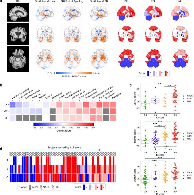
Fig. 5. Neuropathological validation.
We correlated model findings with regional ABC scores of neuropathologic severity obtained autopsied participants in NACC, ADNI, and FHS cohorts (n = 110). a An example case from the Alzheimer’s Disease Neuroimaging Initiative (ADNI) dataset is displayed in sagittal, axial, and coronal views. The SHAP values derived from the second convolutional block and neuropathologic ABC scores are mapped to brain regions where they were measured at the time of autopsy. Visually, high concordance is observed between anatomically mapped SHAP values regardless of the hidden layer from which they are derived. Concordance is observed between the SHAP values and neurofibrillary tangles (NFT) scores within the temporal lobe. b A heatmap is shown demonstrating Spearman correlations between population-averaged SHAP values from the input features of the second convolutional layer and stain-specific ABC scores at various regions of the brain. A strong positive correlation is observed between the SHAP values and neuropathologic changes within several areas well-known to be affected in AD such as the hippocampus/parahippocampus, amygdala and temporal gyrus. c Beeswarm plots with overlying box-and-whisker diagrams are shown to denote the distribution of ABC system sub-scores (horizontal axis) versus model-predicted cognitive scores (vertical axis). The displayed data points represent a pooled set of participants from ADNI, NACC, and FHS for whom neuropathology reports were available from autopsy. Each symbol represents a study participant, boxes are centered at the median and extend over the interquartile range (IQR), while bottom and top whiskers represent 1st and 3rd quartiles −/+ 1.5 x IQR, respectively. We denote p < 0.05 as *; p < 0.001 as **, and p < 0.0001 as *** based on post-hoc Tukey testing. d A heatmap demonstrating the distribution of neuropathology scores versus model predicted AD probabilities. Herein, each column within the map represents a unique individual whose position along the horizontal axis is a descending function of AD risk according to the deep learning model. The overlying hatching pattern represents the dataset (ADNI, NACC, and FHS), from which everyone is drawn. Source data are provided as a Source Data file.

