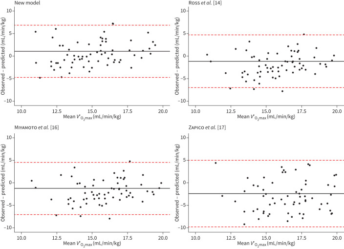
FIGURE 4.
Bland–Altman graphs for the comparison of maximal oxygen uptake (V′O2max) determined by cardiopulmonary exercise testing versus using a predictive model based on 6-min walk test. The x-axis shows the calculated mean between the observed and the predicted values for V′O2max while the y-axis shows the difference between the two methods. The line corresponds to the mean difference in V′O2max and the two dashed lines show the 95% confidence interval. Each panel shows a different model as indicated by the panel's headers.

