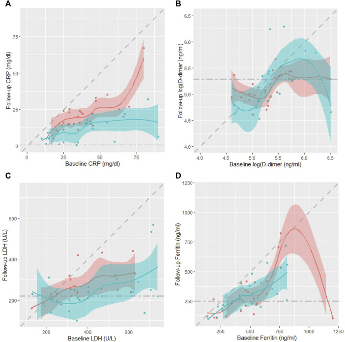
FIGURE 3.
Scatter plots of individual patients’ day seven biomarker values against their corresponding baseline values in the two treatment arms, CQC (blue) and control (pink): (A) CRP, (B) D-dimer, (C) LDH, and (D) ferritin. Scatter plots overlaid with smoothed LOESS curves to help visualize any patterns. Diagonal dashed line denotes line of equality while horizontal dashed line represents the biomarker upper normal limit. The shading represents uncertainty around the smoothed lines between the points.

