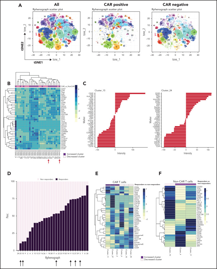
Figure 3.
Immune profiling of CAR T cells and non–CAR T cells in peripheral blood. (A) t-SNE plots of all T cells, CAR T cells, and non–CAR T cells using phenograph analysis. (B) Heatmap showing the composition of the 29 clusters of T cells most different in proportions in CAR T cells compared with non–CAR T cells. Arrows indicate clusters significantly different. Each cluster is a column. Clusters increased in CAR T cells are topped by a purple bar. Clusters decreased in CAR T cells are topped by a pink bar. (C) Composition of cluster 15 and 24 T cells after marker normalization. (D) Stacked bar plot of relative contribution of each group in each cluster (x-axis) vs fraction of cells in that cluster from each group (y-axis). All the CD3 T cells from all patients within a group were combined, and the percentage of total cells contributed to each cluster by each group was calculated and displayed on the y-axis (ie, 50% of cells in cluster X are from the nonresponders group; sum of contributions from the 2 groups for each cluster equals 100%, and each group is displayed in a different color). The clusters (listed on the x-axis) were ordered by relative abundance of responders CD3 T cells. Arrows highlight key clusters that are significantly different (further shown in panel B). (E) Heatmap showing the composition of the 6 clusters of CAR T cells significantly different in proportions in responders compared with nonresponders. Each cluster is a column. Clusters increased in responders are topped by a purple bar. Clusters decreased in responders are topped by a pink bar. (F) Heatmap showing the composition of the 3 clusters of non–CAR T cells significantly different in proportions in responders compared with nonresponders. Patients with clinical benefit (CR, PR, SD) at 3 months are grouped as responders, and patients with PD at 3 months are grouped as nonresponders (n = 11).

