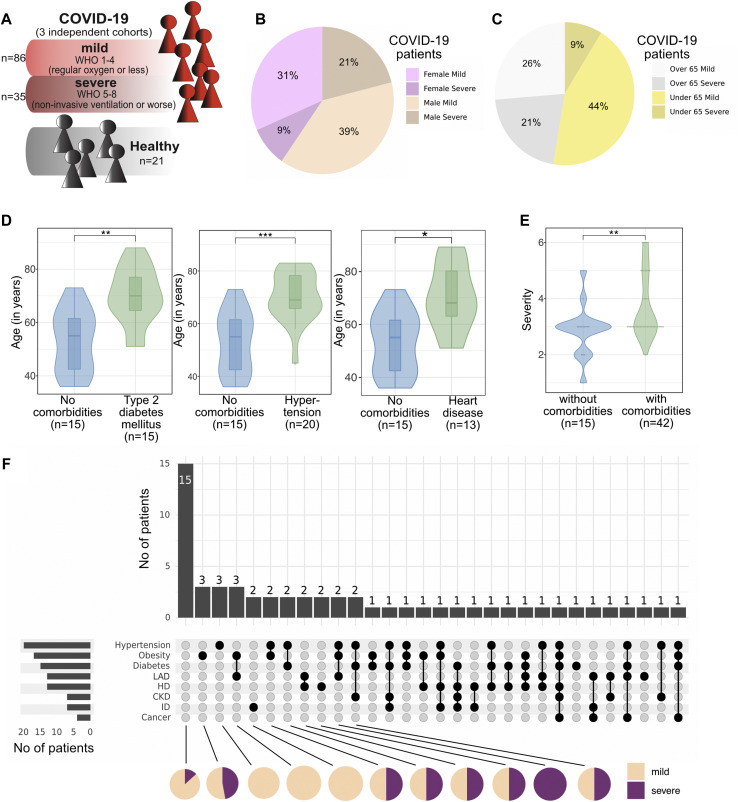
Fig 1.
A, Schematic of the study cohort. B, Proportion of female and male patients developing mild or severe COVID-19. C, Proportion of patients younger and older than 65 years who develop mild or severe COVID-19. D, Violin plot showing the age of patients with the indicated comorbidity versus that of patients without the comorbidity. Box plots depicting the median and 25th and 75th age percentiles. E, Violin plot showing the severity of COVID-19 in patients with at least 1 comorbidity versus in patients without comorbidity. F, UpSet plot to visualize co-occurrence of comorbidities in individual patients with COVID-19. Black dots connected by black lines represent the different comorbidity combinations. Bar plots on top display the number of patients per comorbidity combination. Bar plots on the left display the number of patients per comorbidity. Pie charts below show the proportion of patients with severe and mild COVID-19 in each comorbidity combination (shown for all combinations with more than 2 patients). ∗P < .05; ∗∗P < .01; ∗∗∗P < .001; ∗∗∗∗P < .0001; Mann-Whitney test and Benjamini-Hochberg correction.

