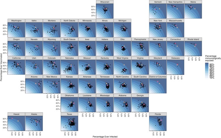
Figure 1.
Estimated percentage immunologically exposed on 1 December 2021, for each US county and state. Background coloring indicates the state-specific distribution of immunity as a function of infections and vaccinations. Black dots represent counties in a state; red dots, the state average. Orange diamonds represent the state population–weighted national averages of the percentage ever infected and vaccinated (this does not represent the national average of immunity because the calculation for immunity is state specific).

