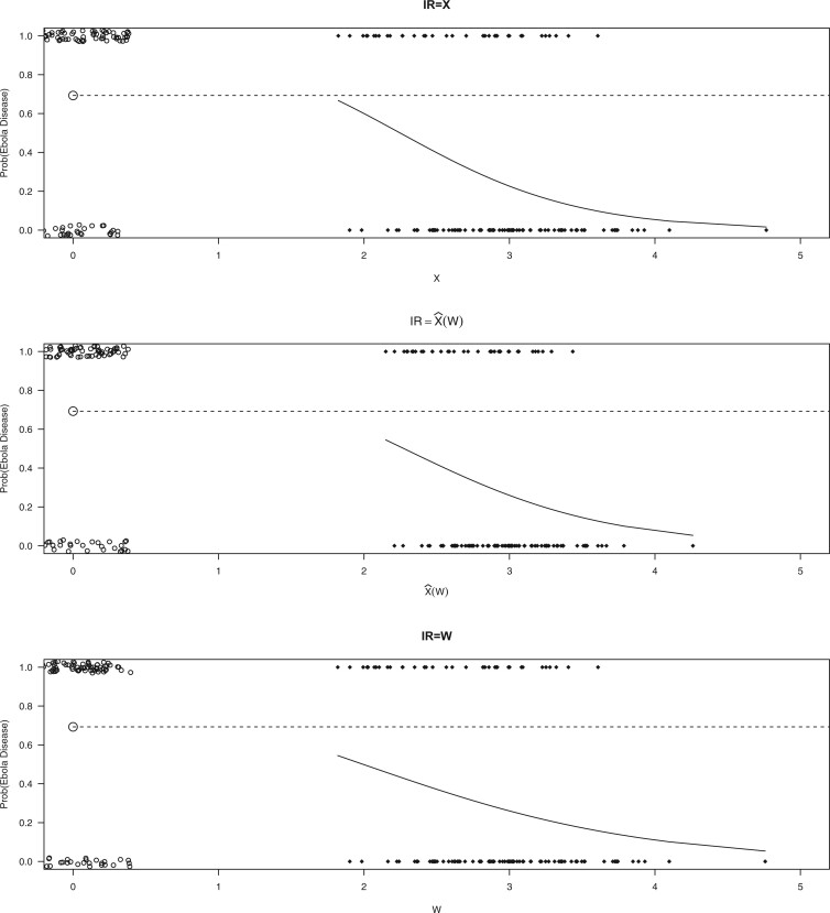
Fig. 2.
Simulated data to illustrate an immune correlates analysis based on a test negative design for the 2018–2020 Ebola outbreak in the DRC. Unvaccinated subjects’ data are given by jittered open circles near x-axis near 0 and whose Ebola disease rate of 0.69 is given by the dashed line. Vaccinated subjects’ data are given by diamonds. The estimated probability of disease for vaccinees is given by the solid curve. The three panels correspond to using  ,
,  , and
, and  as the immune response, respectively.

