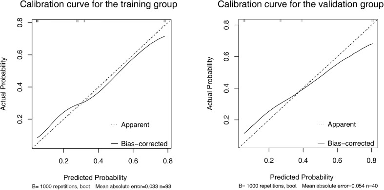
Figure 4.
Calibration curve of the nomogram in the training (A) and validation (B) set. X-axis represents the nomogram predicted probability of Progressive Diseases (PD). Y-axis represents the actual probability of PD, and the diagonal dashed line (represent ideal) indicates the ideal prediction by a perfect model. Results were plotted via bootstrapping with 1000 resamples. The closer the bias-corrected calibration curve (solid line) is to the diagonal line, the higher the prediction accuracy of the model.

