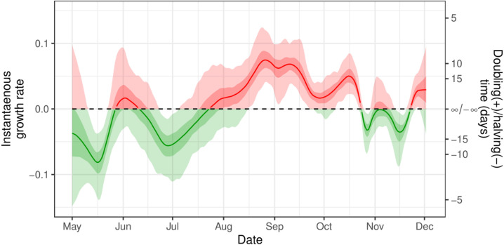
Fig. 4.
Instantaneous growth rate. The instantaneous growth rate over the study period as inferred from the Bayesian P-spline model. The Y axis on the right shows the corresponding doubling/halving time corresponding to the growth rate on the left Y axis. The dotted line shows where growth rate 0 and so the point of transition between epidemic growth and decline. The light shaded regions show the 95% credible interval and the dark shaded regions show the 50% credible interval. Red highlights regions of the credible interval with values of growth rate greater than 0. Green highlights regions of the credible interval with values of growth rate less than 0. (For interpretation of the references to colour in this figure legend, the reader is referred to the web version of this article.)

