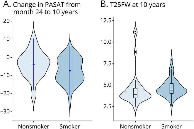
Figure 3. Distribution Plots of Clinical Measurements in Nonsmokers and Smokers.

The width of the shaded area represents the proportion of observations for (A) change in PASAT score from month 24 to 10 years (point range represents the mean and SD) and (B) T25FW test score at 10 years (box plots represent the median and IQR, with the whiskers representing the distribution of observations within x1.5 of the IQR). IQR = interquartile range; PASAT = paced auditory serial addition test; T25FW = timed 25-foot walk.
