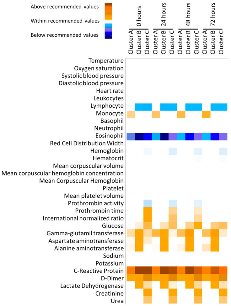
Figure 1.
Heatmap plot of adequacy to reference values for clinical variables included in the cluster analysis. White means that the mean value for the cluster was within the recommended values; meanwhile, blue and orange intensity represent the deviation from the recommended values below and above, respectively.

