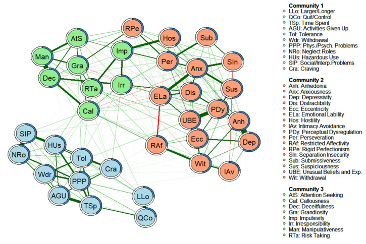
Figure 1.
Empirical network model (network structure estimated from a walktrap modularity analysis) for the complete sample (n = 985). Note. Each node represents a symptom. The edges represent the relationships (partial correlations) between the symptoms. Positive relationships are represented in green, and negative relationships in red. The thickness of the edge reflects the strength of the association, so that the most strongly related symptoms are connected by thicker edges. The blue pie chart surrounding each node represents the predictability of each node (a higher proportion of blue indicates greater predictability). The membership of the nodes to the different communities is represented by different colors: the symptoms of Community 1 are shown in blue, the symptoms of Community 2 are shown in salmon, and the symptoms of Community 3 are shown in green. The arrangement of the nodes was established based on the Fruchterman-Reingold algorithm.

