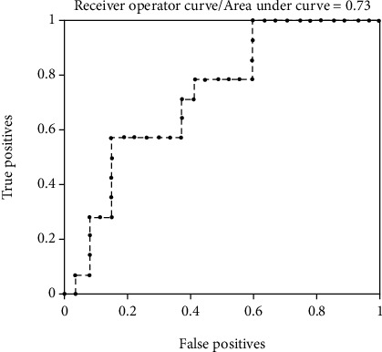
Figure 2.

The ROC curve graph of gray matter volume in evaluating the difference between the AIDS group and the control group in machine learning. The horizontal axis represents the negative samples (true positives) predicted by the model as positive, and the vertical axis represents the positive samples predicted by the model as positive (false positives), the area under the ROC curve = 0.73, which means that the gray matter volume has a certain accuracy in evaluating the difference between the HIV-positive group and the control group.
