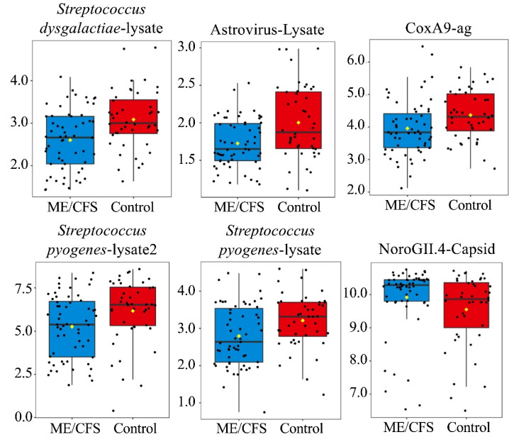
Figure 2.
Boxplots-6 antigens with significantly different antibody levels from controls following outlier replacement (p < 0.05, q > 0.05). Antigens are listed from left to right and top to bottom based on p-value (Table 2). Y-axis = log2MFI values. Yellow diamond indicates sample mean. Black line running horizontal through the boxplot indicates sample median.

