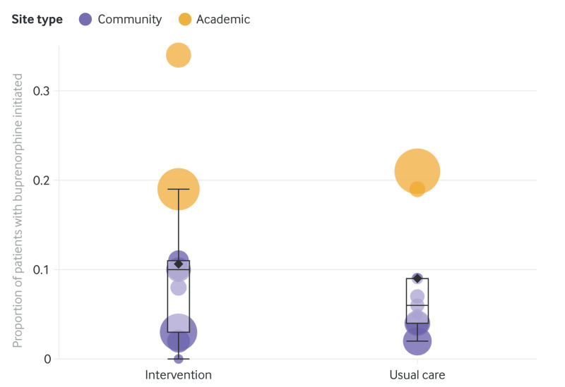
Fig 2.
Bubble plot by study arm (intervention or usual care) showing proportion of patients with opioid use disorder receiving buprenorphine by cluster site (academic and community). Each bubble represents one cluster. Bubble area is proportional to the number of patients with opioid use disorder. Vertical position represents the proportion of these patients with buprenorphine initiated. Box lines indicate median, top, and bottom quartile values of the primary outcome by cluster, whiskers indicate the last value within 1.5 interquartile ranges, and the diamond indicates the mean value of the primary outcome by cluster. An interactive version of this graphic is available at https://bit.ly/39aojsT

