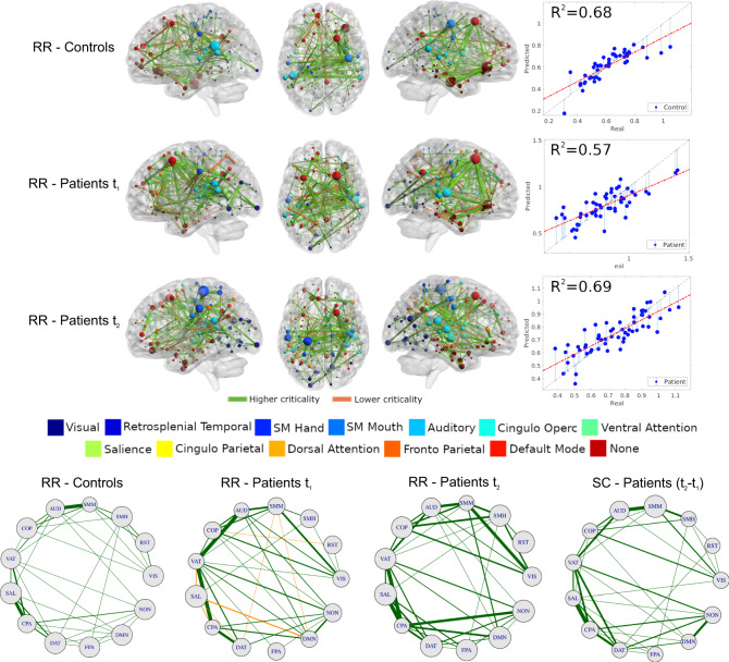
Fig. 5. Structural connectivity related to criticality (integral of the second cluster size I2 = ∫S2dT).
Top: map of predictive connections of W (see Eq. (14)). Structural edges that predict higher (green edges) and lower criticality (orange edges) values (top: controls; middle: patients at t1; bottom: patients at t2). Only the highest 200 connections are shown for ease interpretation. The size of each ROI, colored by network, corresponds to the number of predictive edges converging on it. The scatter plot shows real vs. predicted criticality values from the Ridge Regression model. The gray dashed line has a slope of one and is a guide to the eye. Circle plots: architecture of averaged network connections across resting-state networks (〈W〉X,Y, see main text). The first three plots, from left to right, represents the ridge regression maps (Eq. (14)), while the last map represents the difference of the patients' structural connectivity matrix at t2 − t1. The size of each RSNs corresponds to the average connections within networks. Source data are provided as a Source Data file.

