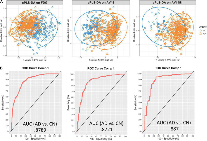
FIGURE 3.
Sparse PLS-DA plots for gene selection. (A) Sample plots from sPLS-DA performed on the gene expression – PET intensity correlation data including 95% confidence ellipses. The samples are projected into the space spanned by the first two components and colored by group: blue for AD and orange for CN. (B) Receiver Operator Characteristic (ROC) curve and AUC on the expression-intensity correlation data for component 1.

