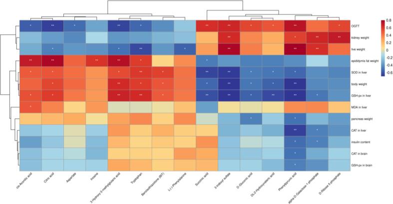
Fig. 6.
Spearman's correlation analysis between potential marker metabolites and AD indices. Heatmap based on Spearman's correlation analysis. Color changed from blue for negative to red for positive correlations. (For interpretation of the references to color in this figure legend, the reader is referred to the web version of this article.)

