
Fig. 3.
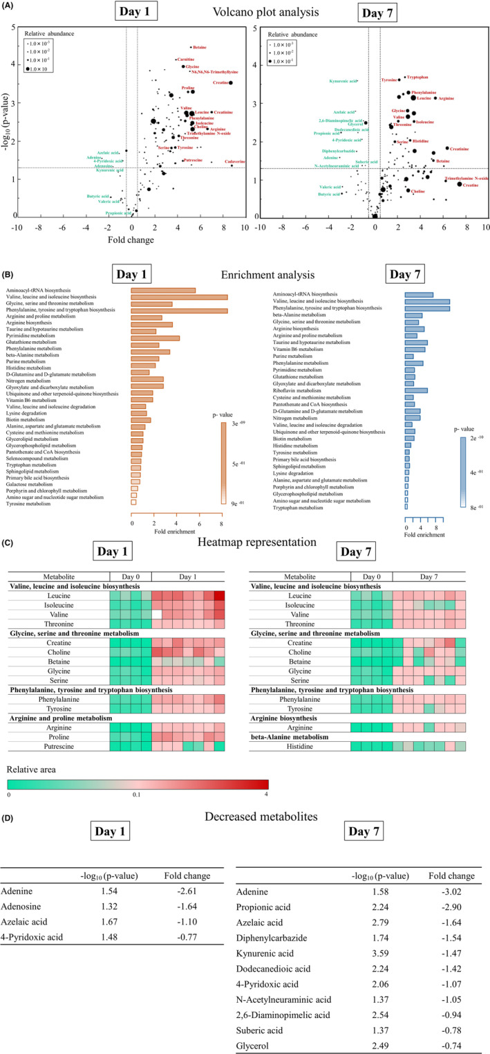
A, In volcano plots, the y axis shows adjusted P‐values (−log10(P‐value)), and the x axis shows fold change for the metabolites. The horizontal dashed line indicates a P‐value of 0.05. The vertical dashed lines indicate fold changes of 0.5 or − 0.5, respectively. The size of the circles indicates the averaged abundance of each metabolite. The names of the metabolites discussed in our study or previously reported are indicated next to each circle. Red color indicates over‐expressed metabolites, and turquoise indicates under‐expressed metabolites. B, Metabolite set enrichment analysis identified significantly enriched metabolite sets among the metabolites increased on day 1 (left) and day 7 (right) compared to day 0. C, Heatmap representation of metabolites that were significantly enriched on day 0 and day 1 (left) and on day 0 and day 7 (right). Red indicates high expression and turquoise, low expression. D, Metabolites that were significantly decreased on day 1 (left) and day 7 (right) compared to day 0.