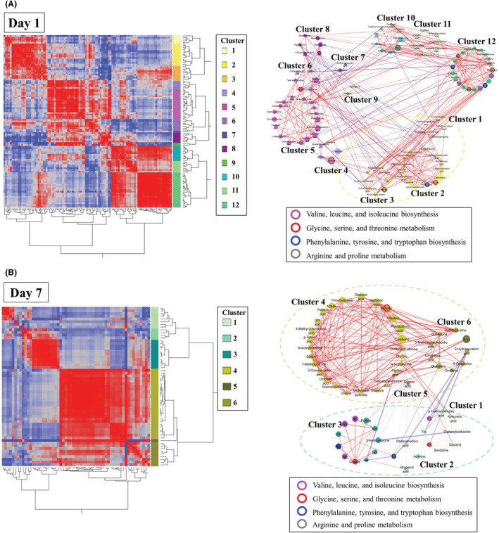
Fig. 4.

A, Biclustering of metabolites and network visualization on day 1. In the biclustering analysis, the metabolites were classified into 12 categories on day 1 (left side of A). The network visualizes the significant correlations of biclustering on day 1 (right side of A). The different node colors indicate different categories. The lines enclosing the nodes indicate those belonging to the enriched metabolite set. The thickness of the line between the nodes indicates the degree of correlation. Red and blue lines indicate positive and negative correlations, respectively. The dotted‐line boxes indicate categories corresponding to those in biclustering. B, Biclustering of metabolites and network visualization on day 7. In the biclustering analysis, the metabolites were classified into 6 categories on day 7 (left side of B). The network visualizes the significant correlations of biclustering on day 7 (right side of B).
