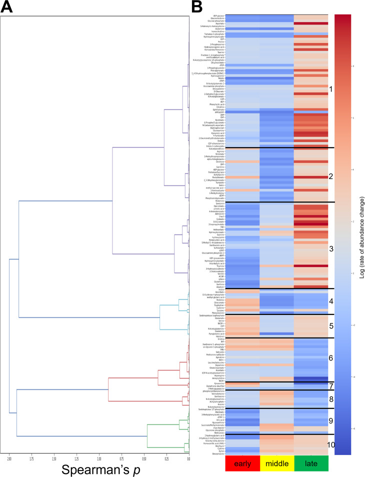
FIG 6.
Hierarchical clustering analysis of detected metabolites revealed 10 clusters, within each of which the metabolites displayed similar rates of change over the infection. (A) Dendrogram corresponding to Spearman correlation values for each metabolite. (B) Identified metabolite clusters as depicted by numbers 1 to 10 with similar log(rate of change) over the life cycle for the time phase compared to the previous time phase: early compared to uninfected (early), middle compared to early (middle), and late compared to middle (late). Metabolites with a red gradient exhibit an increased molecular abundance shift, and metabolites with a blue gradient exhibit a decreased molecular abundance shift.

