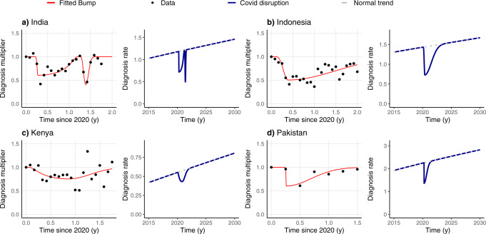
Fig. 1. Changes in the diagnosis rate before, during, and after the pandemic period.
We present both the original data and the fitted bumps we use for modeling the disruption, along with the diagnosis rates in two scenarios: the baseline, with no disruption (dotted lines), and the pandemic scenario, where the drop in diagnosis happens and is followed by a return of the diagnosis rates to the baseline scenario. Diagnosis multipliers are obtained directly using the WHO data as the TB notifications in that period divided by the mean of TB notifications in the year 2019. The four countries considered are (a) India, (b) Indonesia, (c) Kenya, (d) Pakistan.

